Physical Address
304 North Cardinal St.
Dorchester Center, MA 02124
Physical Address
304 North Cardinal St.
Dorchester Center, MA 02124

Liberalizing Cities
From The Ground Up
A new NBER paper by Yu-Hsin Ho (an incoming Harvard grad student) and three co-authors including Chiang-Tai Hsieh, contrasts zoning-segregated U.S. metro areas to Taipei, Taiwan, which allows mixed uses almost everywhere. The most interesting finding is a ranking of 34 US metro areas by the specialization within block groups. Taipei, with low specialization, is below all the US metros:
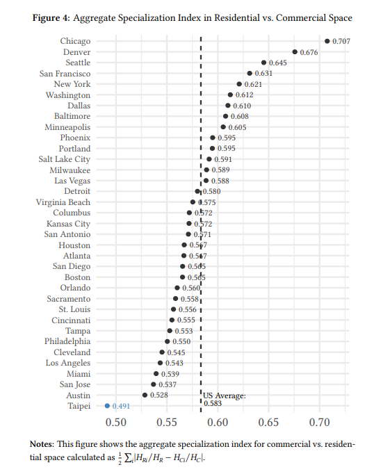
I would have guessed that the most mixed-use American metros were old ones, with many neighborhoods built before zoning and widespread car ownership: New York, Philadelphia, Boston, Chicago.
But no: Austin is the US champ, followed by San Jose and Miami. At the opposite end, Chicagoland is off the charts in its degree of use segregation. There doesn’t seem to be a rhyme or reason: the four Texas cities are scattered across the chart. The two halves of the Bay Area (SF and San Jose) are on opposite ends, and not in the way I’d have expected. The Midwest is represented all over the chart.
Of course, having commercial and residential space in the same block group doesn’t mean that the two are integrated in a traditional neighborhood form.

Do Ho et al find this result because of patterns in how block groups are constructed? Or because some cities have much bigger downtown peaks? The latter appears to be part of the explanation for Chicago and Denver. Looking under the hook, the coefficient of variation of commercial floorspace per block group is 16 in Chicago, about 5x more than the median city, despite those two cities having the highest commercial space share. In the index, that makes a block group with 1000 residences and 10 shops look much more segregated if it’s in Chicago than if it’s in, say, Milwaukee.
The results don’t appear to come from some cities having bigger block groups than others, or larger commercial shares overall (except Chicago and Denver).
I would welcome complimentary approaches to understanding this question. Are my intuitive guesses ultimately more reliable? Or is the data-speaks approach telling us something important about mixed uses in the US?
(As for the rest of the paper, it’s very creative in squeezing a lot of results from limited data. But I’m skeptical of the core findings, which are based on the assumption that the crowding of workers per unit of commercial floorspace and residents per unit of residential floorspace are accurate proxies for prices.)





Also: a city can have single-use zoning but it doesn’t matter so much if the zoning is fine-grained (which is a fancy way of saying that there is a commercial street every 3 blocks instead of every 20 blocks). Perhaps Chicago might be an example of this.
I think that would cut the opposite way. A block group covers several city blocks. Chicago’s main avenues are on a 1/2 mile square grid. Virtually every Block Group borders one. A large number of block groups cover exactly a squared half-mile. If they all had commerce, you’d expect an extremely even distribution of jobs. See the map of BGs: https://censusreporter.org/profiles/15000US170311605012-bg-2-tract-160501-cook-il/