Physical Address
304 North Cardinal St.
Dorchester Center, MA 02124
Physical Address
304 North Cardinal St.
Dorchester Center, MA 02124

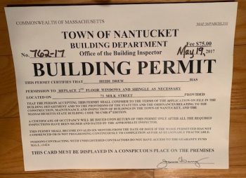
In a recent post, I revealed the 91 large cities and counties that consistently fail to report complete data to the federal Building Permit Survey (BPS). But what about smaller jurisdictions, which often have weak record-keeping and slim staffs – and what about states made up of many such small jurisdictions? The gold standard for counting housing units is the Decennial Census. That shows that the number of homes in Massachusetts grew from 2,622,000 in 2000 to 2,808,000 in 2010 to 2,998,000 in 2020. Even though building permits do not always result in completed homes, local reports and Census Bureau interpolations fall well short: It’s possible that some building permits pulled in 2007-2009 were delayed by the Great Recession but completed after the 2010 census. Taking the twenty-year period together, the BPS (2000-2019) is only picking up 84 percent of completed homes – not to mention those that are permitted but abandoned. Looking ahead, Gov. Healey’s administration has estimated (poorly) that the commonwealth needs 222,000 new homes by 2035. How does that compare to recent production? We don’t have a 2024 Census. But if we assume that reported 2015-2024 building permits turn into housing at the same rate that 2000-2019 building permits did, we can get a working estimate. The BPS reports 167,000 Bay State building permits from 2015 through 2024 (with extrapolation for December, 2024). That means that something closer to 199,000 new homes were likely completed in that period. If that’s true, then the administration’s “housing need” estimate is just 12% higher than recent construction – which has been inadequate to prevent a huge upswing in rents and prices.

I'm pre-disposed to find reasons to love Gregg Colburn and Clayton Page Aldern's book *Homelessness is a Housing Problem*. But the book moved my priors in the opposite direction than the authors intended.
In July, I showed that an otherwise careful group of researchers at the Othering and Belonging Institute were using a measure of statistical racial segregation that confounds diversity with segregation. Briefly, regions with more variety in the racial makeup of their neighborhoods will show up as statistically “segregated.” Regions where all neighborhoods are pretty similar will show up as statistically “integrated.” To their credit, the study authors corresponded with me at length and adjusted their Technical Appendix to emphasize limitations that I had pointed out. Today, Mark Zandi, Dante DeAntonio, Kwame Donaldson, and Matt Colyar of Moody’s Analytics released a much less careful study purporting to show the “macroeconomic benefits of racial integration.” But if one were to make the mistake of taking their study at all seriously it would lead one to the opposite conclusion: mostly-white counties do better economically. They discovered white privilege and mislabeled it “integration.” (When economists talk about “segregation” statistically, they mean differences in racial proportions across neighborhoods. This is not the same as the de jure segregation regime imposed in the American South. It’s not even the de facto segregation that persists in some neighborhoods today.) The easiest way to see Zandi et al’s mistake is to work backwards from the table of county results they (helpfully) published. The most integrated county in America, in their analysis, is Kennebec County, Maine. It’s 94.6% white. The rest of the most-integrated counties are similarly pallid – with the exception of Webb County, Texas, which is 95% Hispanic. In each of these counties, integration is a mathematical product of the lack of diversity. With hardly any minorities, hardly any neighborhood can diverge from the dominant group. These extreme counties aren’t an accident. Whereas most researchers treat metropolitan areas together, Zandi’s team worked with counties. Several of their […]
Headlines last month proclaimed that “Cities Have Grown More Diverse, And More Segregated, Since the 90s.” The headlines originate in the key findings of a new, detailed study from the Othering and Belonging Institute (OBI) at UC Berkeley. The study leans heavily on a relatively new metric – the Divergence Index – which has impressed many researchers (myself included) with its versatility. But now that we have seen the Divergence Index in action, its versatility clearly comes at a cost: the Divergence Index conflates what we would intuitively call diversity with “segregation.” As a result, more-diverse metro areas are usually ranked as more segregated by the Divergence Index. And as America became far more diverse over the past 30 years, it is logical that the Divergence Index would rise in most metro areas. Why is it so hard to measure segregation? Racial segregation is easy to see. You walk down the street and almost everybody in one neighborhood looks different than you and almost everybody in another neighborhood looks the same as you. The human eye and ear can also distinguish categories that are meaningful in some contexts but not others. Everybody but me in the café where I watched European soccer last week appeared to be not only Black but specifically Ethiopian. Was that café integrated or segregated? I certainly felt welcome as I bantered at the bar with an Ethiopian-American tennis instructor. But statistically, the café was far more Black and vastly more Ethiopian than the D.C. region as a whole. In this context, “segregation” refers to places where one group is overrepresented – like the café – not to the legal regime that imposed second-class citizenship and pervaded every aspect of life for black Americans. Given the word’s loaded history, it would have been wiser for social […]